Improved insights, higher results

Improved data quality

Big data can sometimes be like a jungle. By looking for missing data, possible deviations and points for improvement, you can increase data quality and ensure that your data is complete and in order.

Result-oriented analysis

Thanks to the many filter and slicing options and "down drill" techniques, you quickly get to the core of the problem, which leads to the solution. Using the right visuals and KPIs, you quickly gain insight into your data.

Supporting to your strategy

In advance, we map out together what is important and which performance indicators will be steered towards. These are visualized as clearly as possible and support you in the story you want to convey.

Dashboards and reports

One source or a combination of sources?

Data is everywhere and can come from countless sources. By sometimes connecting multiple sources (e.g. ERP, CRM and separate Excel documents) you can connect the data in different ways, resulting in powerful insights.

Real-time data or a snapshot?

Are you looking for up-to-date information (e.g. refreshed daily) or do you want to analyze a snapshot? Discuss the options and how you want your data presented.

Below you will find a number of examples.

Services

Data analysis

An analysis starts with the right quality of data. This is the starting point for clear and concise reporting.
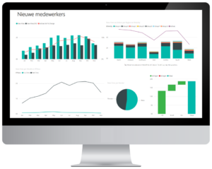
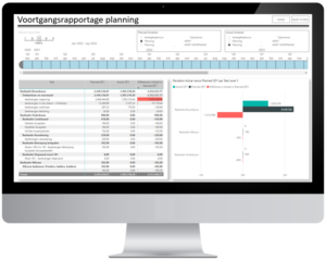
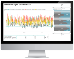
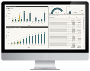
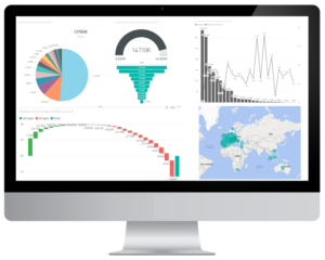
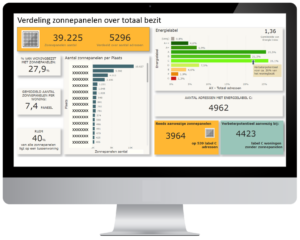
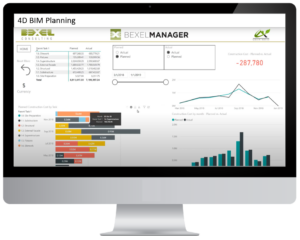
Data visualisation

By applying the right visuals in the analysis, you quickly gain insight. The dashboard is constructed in such a way that you are at the helm and you can descend down to the required level of detail.

Data storytelling

Use your data to tell your story. Include your target audience in the message you want to convey. The data is processed in an informative and creative way, for example as an infographic.

Dashboard step-by-step plan

  • STEP 1: Together we determine the target group and information needs in the form of KPIs/performance indicators that will be managed.
  • STEP 2: Which (desired) data sources can be linked to create a single dashboard environment for quick interpretations.
  • STEP 3: Customized visual analyzes processed in dashboards in the desired corporate style. An evaluation will follow after commissioning.

Implementation, presentation and support

  • Implementation of the dashboard in your organization. Who receives access and which user roles can be assigned so that groups or individuals see only the information that is intended for them.
  • Presentation of the dashboard to end-user(s) with an explanation of the structure and use of the displayed KPIs and visuals.
  • Support for possible changes in the data structure and/or visualization needs.

.

READY TO WORK DATA DRIVEN?

 TAKE YOUR DECISIONS ON FACT-BASED SUBSTANTIATIONS 

About me

Karin Wijnen

Business intelligence analyst

"Data is inseparably linked to me"

Data has been a common thread throughout my career. I have gained international experience in various fields including procurement, export, market research, product management, sales & marketing, business development, sustainability, and company acquisitions. During this time, I have focused extensively on the analytical side and generating reports.

I have always been interested in transforming data into information that supports strategic decision-making. Combining my analytical skills with my creativity, I strive to make data tell a story!                                                                     

Contact me

Telephone:

+31 (0)6-22764052

Email:

info@datajungle.nl

Contact form
Schuiven naar boven